Responsive website design addresses the need for websites to be able to adjust design and layout according to the device a visitor is using to access the site. These specific layout changes need to be based on the size and capabilities of different mobile devices such as smartphones and tablets.
This infographic helps explain the basics of responsive website design:
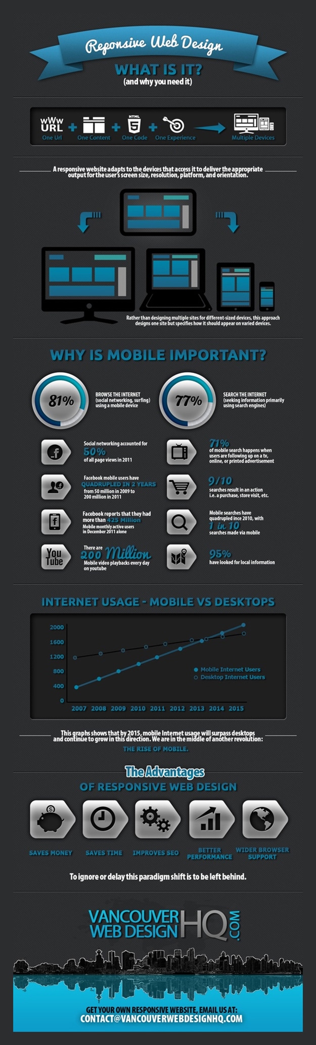
[Infographic via BitRebels]
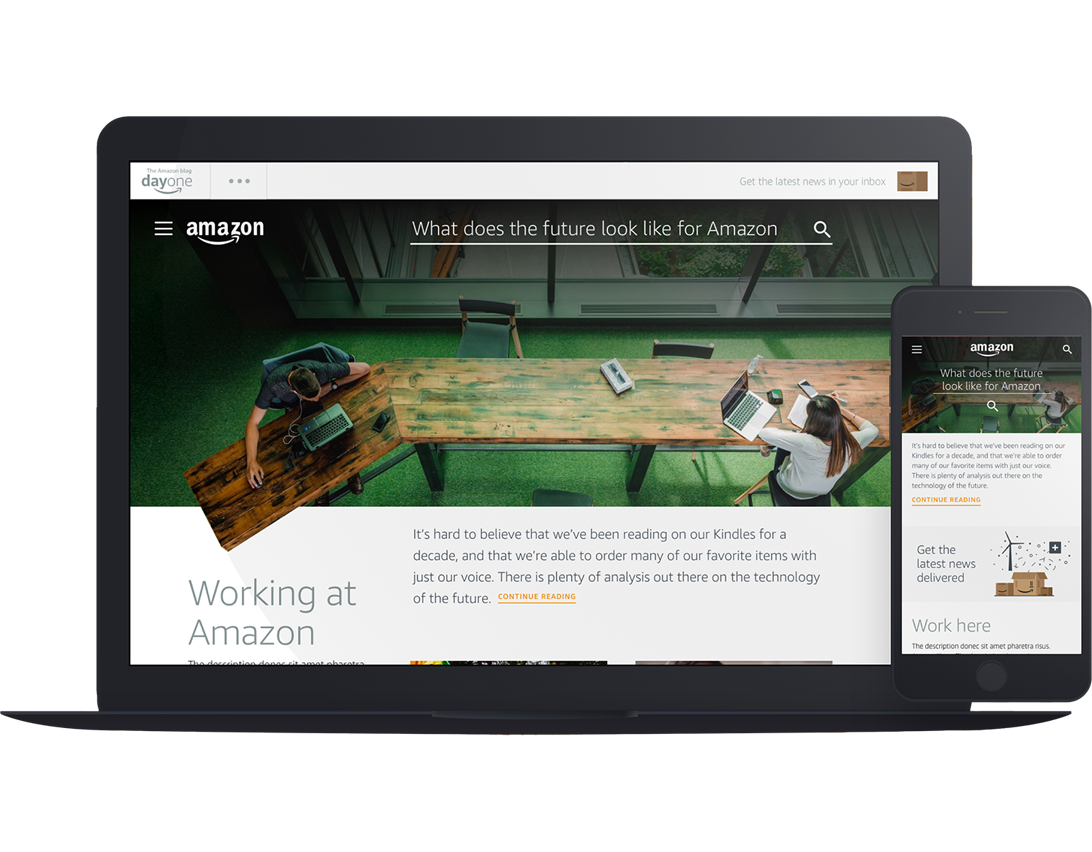
To see responsive design in action, open our Homepage on a desktop browser and slowly make the browser thinner or wider. You should see the layout adjust itself to fit the new width of the browser, even if you make the page as skinny as the resolution of a mobile phone.
If it has been more than two years since you updated your website, it’s time to start thinking about an overhaul. Content Management Systems are much more advanced than they were several years ago, and provide many new features for you and your users!
Ready to make your website responsive and mobile-friendly? We specialize in brand strategy by helping company’s build a consistent brand experience on all digital touch-points.